Not Every Word
I make 25–45-second Indonesian explainer Shorts as a VTuber, and my editor draws the captions straight into the video. I kept wondering whether every word really needs to be on screen, so I did the research properly and wrote it up as a small working paper. This post is that paper.
Abstract. Short-form vertical video is watched in feeds, often with the sound off, and its captions are burned into the picture. A burned-in caption therefore does two jobs: it is the accessible record of what was said, and it is graphic design. This paper asks when on-screen text should repeat speech, add to it or replace it, for one working case: a channel of 25–45-second Indonesian explainer Shorts presented by a VTuber. I combine a measurement of the channel's captions, a review of subtitle standards (Netflix, BBC, DCMP, FCC, WCAG) and of reading research, and a review of East Asian variety practice: Japanese telop, Korean 예능 자막 and Chinese 花字. The channel's caption pages last a median of 0.62 s and 74% are shorter than Netflix's 5/6-s minimum, while the speaking rate (134–197 words a minute) sits within broadcast norms. Variety editors keep a plain verbatim layer and add a small, consistent set of designed exceptions on top. Reading studies find that an emoji replacing a word costs about 300–350 ms, while an emoji placed after its word does not. I propose two layers: an exported subtitle track that never changes, and a burned-in page that may step aside, add an emoji or a picture, or change style, within limits graded by the strength of their evidence. A first implementation of a 0.8-s minimum page time barely moved the share of short pages (95% to 94%) because the large one-line layout is the binding constraint; a simulated two-line budget brings it to 17%.
1. Introduction
A Short is decided in its first seconds. Viewers scroll a feed, many with the sound off: in a 2019 survey of 5,616 US adults, 69% said they watch video with the sound off in public and 25% even in private, and 80% of caption users had no hearing impairment (Verizon Media & Publicis Media, reported by StreamingMedia). On my channel the captions are drawn into the frame by the editor, so every viewer sees them and none can switch them off.
That makes the burned-in caption a design object as much as an accessibility feature. Subtitle standards were written for switchable subtitles on 16:9 screens, and they ask for verbatim text, phrase-shaped line breaks and a minimum display time. Short-form fashion asks for big, bouncing, colourful words. East Asian variety television has spent forty years on a third answer: an editor's second voice that sometimes repeats what is said, sometimes adds what is not said, and sometimes leaves the words alone.
The technique I wanted to try: not every word needs to be drawn as caption text. A word could step aside when the same words are already on screen, become an emoji or a small picture, or take a different style, while the exported subtitle track stays verbatim. This post tests that idea against the evidence.
Question. For a 25–45-second Indonesian VTuber explainer in 9:16, when should burned-in text repeat speech, add to it, or replace it, and under what limits?
Contributions:
- A measurement of a working channel's caption pages (533 pages in 11 projects), with a second measurement through the channel's own editor after a change (Section 7).
- A synthesis of subtitle standards and reading research, with every claim labelled by the kind of evidence behind it.
- A review of Japanese, Korean and Chinese variety practice, condensed into five relations between on-screen text and speech.
- A two-layer caption design with evidence-graded guidelines, and its first implementation.
2. Method
2.1 Literature and practice review
I read the sources on 7–8 October 2026: the published subtitle guidelines of Netflix (general, Indonesian, Japanese), the BBC (v1.2.5, March 2026, the only one with explicit 9:16 numbers), DCMP's Captioning Key, the FCC's caption-quality rule and WCAG 2.2; eye-tracking and reading studies on subtitles, captions and emoji; and research papers, trade press and practitioners' accounts of Japanese, Korean and Chinese variety editing. Every source in the reference list was opened. Where a page could not be opened (a paywall or a bot check), the claim was dropped or marked as second-hand.
Each claim carries one label: standard a published guideline; study research with a method and a sample, whose size is given because several are small; practice what editors and shows do, documented by a researcher, broadcaster or the show's own staff; opinion a vendor's, a blogger's or my own judgement, never presented as evidence. Second-hand marks a claim read in a source that cites it rather than in the original.
2.2 Measuring my captions
My captions are produced by my own editor, Poiesis: word timings come from speech recognition (ElevenLabs Scribe v2, or Whisper large-v3), are corrected by hand for recognition errors only, and are grouped into pages of at most one line of 16 characters and 4 words. I read every project's subs/captions.json in my projects folder (11 projects, 533 pages, measured 8 October 2026). A page lasts from its first word's onset to the next page's onset when the gap is under 0.5 s, otherwise to its last word's end. I report page duration, words per page, characters per second per page and speaking rate.
2.3 Testing a change in the editor
After the first measurement, a minimum page time of 0.8 s and phrase-aware breaks were built into the editor as the default (Section 7). To see what they do, I ran the editor's own caption code, read-only, on all 12 projects that had captions by then, at 1080×1920: the default look (bubble) and the older house look, each with and without the minimum. I also simulated a page budget of two lines (32 characters, at most 6 words) with the same joining rule, ignoring font metrics.
2.4 Grading the guidelines
Section 6 grades each guideline: A standards and at least one study agree; B one or two studies, or consistent documented practice; C practice or opinion only, to be tested.
3. Findings
3.1 My pages are too short to read comfortably
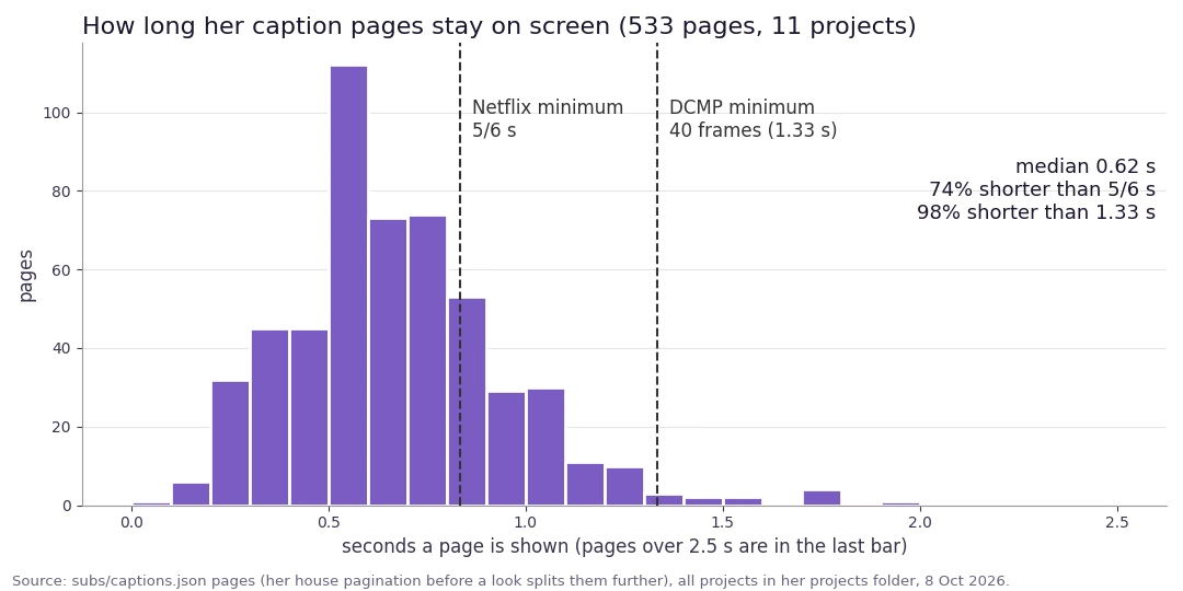
subs/captions.json on 8 October 2026. Dashed lines: Netflix's minimum event duration (5/6 s) and DCMP's (40 frames, about 1.33 s).Table 1. My caption pages (11 projects)
| Measure | Value | Reference |
|---|---|---|
| Pages | 533 | |
| Median page duration | 0.62 s | Netflix minimum 0.83 s; DCMP 1.33 s; BBC about 0.3 s a word |
| Pages shorter than 5/6 s | 74% | |
| Pages shorter than 0.5 s | 24% | |
| Pages shorter than 40 frames (1.33 s) | 98% | |
| Words per page (mean) | 1.86 | |
| Pages over 17 characters a second | 45% | Netflix Indonesian: 17 cps adults (20 for SDH) |
| Speaking rate (per project) | 134–197 wpm | BBC target 160–180 wpm |
My speaking rate is normal for subtitling standard; the pages are not. Pauses over 0.5 s, the one-line rule and the 16-character limit split the speech into flashes of under two words. The high per-page reading rate comes mostly from the short pages: merging two neighbours averages out the spikes. With the audio on, a hearing viewer can follow by ear, so the cost falls on muted viewers, deaf and hard-of-hearing viewers and anyone reading along, the very viewers captions exist for.
3.2 What the standards agree on
Table 2. Subtitle standards, condensed standard
| Topic | What they say |
|---|---|
| Minimum time | Netflix 5/6 s (20 frames at 24 fps); DCMP 40 frames; BBC about 0.3 s per word, never leading speech or lingering over 1.5 s after it. |
| Reading speed | Netflix Indonesian 17 characters a second for adults, 20 for SDH; BBC 160–180 words a minute; DCMP 130–160 wpm by school level. |
| 9:16 | BBC: up to 3 lines, about 25 characters a line at a line height of 3.9–4.5% of the frame, 90% of the width; sit "a little higher" than in 16:9 but still in the lower third. |
| Line breaks | Break after punctuation and before conjunctions and prepositions; never split article and noun, adjective and noun, first and last name, or the parts of a verb (Netflix, BBC 3.4, DCMP). |
| Placement | Never over faces, mouths or featured on-screen text (FCC, BBC 10.1, Netflix, DCMP); open captions must not hide relevant information (WCAG). |
| Text already on screen | Netflix deletes forced narratives identical to on-screen text and never mixes on-screen text with dialogue in one subtitle; BBC 2.10 requires subtitles to carry on-screen text that is illegible at streaming size. |
| Emphasis and speakers | BBC: capitals for stress, sparingly; one colour per speaker, kept for the whole programme. Netflix Japanese: 傍点 (side dots) for emphasis. |
| Verbatim and sound | FCC: the spoken words in order, no substitution or paraphrase except for time; BBC: prefer verbatim, never simplify; WCAG 1.2.2: captions include sound effects, music and speaker identification. |
These were written for switchable subtitles. They are the floor for readability, not a style guide for Shorts. The platforms publish safe zones only for ads; my editor's own measured zones (the bottom fifth for the player's controls, a right rail from 86% of the width) are stricter than anything the platforms publish.
3.3 What reading research adds
- Speed is less of a problem than chopping. In eye tracking, 74 viewers kept up with subtitles at 12, 16 and 20 characters a second without losing comprehension (Szarkowska & Gerber-Morón 2018)
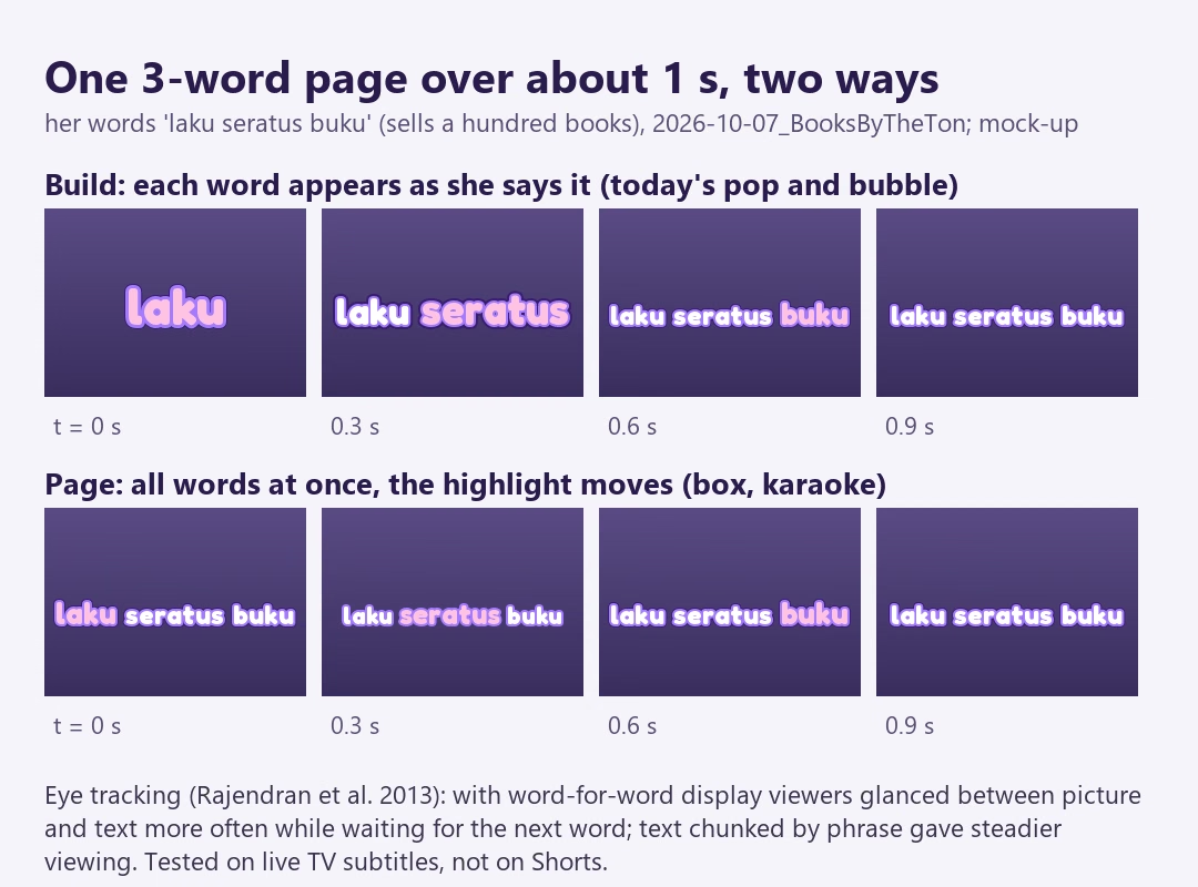
study; another study already saw a cost at 20 cps and a clear one at 28 (Kruger et al. 2022)study. Breaks that cut through phrases raised effort and frustration without lowering comprehension (Gerber-Morón et al. 2018)study. - Building a page word by word pulls the eye. With live subtitles shown word for word, viewers switched between picture and text more often than with phrase chunks (Rajendran et al. 2013)
study. Many short-form looks, including two of my editor's, build their pages this way. - Muted viewers depend on every page. Without sound, 168 viewers had higher cognitive load and lower comprehension and leaned on the subtitles (Szarkowska et al. 2024)
study. - Captions help most people. A review of more than 100 studies found captions improve comprehension, memory and attention, especially for second-language viewers and deaf and hard-of-hearing viewers (Gernsbacher 2015)
study. - Placing captions near the action gave hearing-impaired viewers gaze patterns closer to those of viewers without subtitles (Brown et al. 2015)
study. - Redundancy cuts both ways. On-screen text identical to narration impaired learning, slightly different text helped, and learners still preferred identical text (Yue, Bjork & Bjork 2013)
study. Partial captions synchronised to speech matched full captions for second-language learners (Mirzaei et al. 2014)study, while irregular keyword captions distracted (Montero Perez et al. 2014, second-hand).
3.4 Emphasis and motion
Every source that discusses frequency says to emphasise rarely. BBC 11.2 warns that text sprinkled with capitals is hard to read standard; a highlighted word is the one learners remember (Finger Bou & Muñoz 2024, 17 children) study; and in Japanese variety shows the telops that print whole utterances stay white while colour is kept for the cut-out keyword (Morikawa 2023) practice.
For how to emphasise, the best evidence comes from deaf and hard-of-hearing viewers: across three studies with 39 participants, font colour combined with weight, or colour combined with size, was preferred over seven other typographic encodings and best let viewers recognise the speaker's emotion (de Lacerda Pataca et al. 2024, Caption Royale) study. Loudness mapped to weight, pitch to baseline and duration to spacing let 117 people match text to its audio 65% of the time, whether the text moved or not (de Lacerda Pataca & Costa 2023) study. In a small eye-tracking test, font changes and animated effects scattered viewers' gaze (Sasamoto & O'Hagan 2020, preliminary) study. So motion should mark time (a page appears when it is spoken, the highlight follows the voice) and only one thing should move at a time.
3.5 Emoji and pictures
Replacing a word with a picture has a measured cost. In self-paced reading, an emoji standing in for a noun took about 800 ms against about 450 ms for the word, and over 900 ms when it depicted a homophone (Scheffler et al. 2021, via Ruhr University Bochum) study. In eye tracking, replacement emoji drew longer total viewing than words and ambiguous emoji were worse on every measure, while an emoji placed after its word drew less viewing than the word itself (Paggio & Tse 2022) study. Very frequent emoji behave almost like words in Chinese text, at about 50 ms extra (Lu et al. 2025) study; the authors suggest a logographic script makes emoji cheaper, so the English figures are the better guide for Indonesian. Deaf and hard-of-hearing users did not prefer emoji captions in a preliminary study (Oomori 2022, n = 4) study. On a page that lasts 0.6 s, a third of a second is a large share.
4. Case studies: how variety television decides
Japanese telop (テロップ), Korean variety captions (예능 자막) and Chinese "flower text" (花字) are open captions added in post-production by the producers. They change colour, font and size with the tone of the words, show fragments rather than whole statements, and are explicitly not an aid for deaf viewers (Higashino; Sasamoto & O'Hagan 2016, 2020). They are the closest professional practice to a designed Short, and they have decided, show by show, when text should repeat, add or step back.
4.1 Japan: 月曜から夜ふかし
Morikawa (2023) surveyed 7 news and 15 prime-time variety programmes broadcast between 31 August and 7 September 2022 and graded their telops from ◎ (the whole utterance) through 〇 (a summary), △ (a keyword or fragment) to × (nothing) practice. Every one of the 15 variety programmes put more telop on filmed segments than on studio talk. Studio talk repeats what the film already showed, filmed speakers are mostly members of the public whose speech is less clear, and full telops on studio talk would remind viewers that it is recorded.
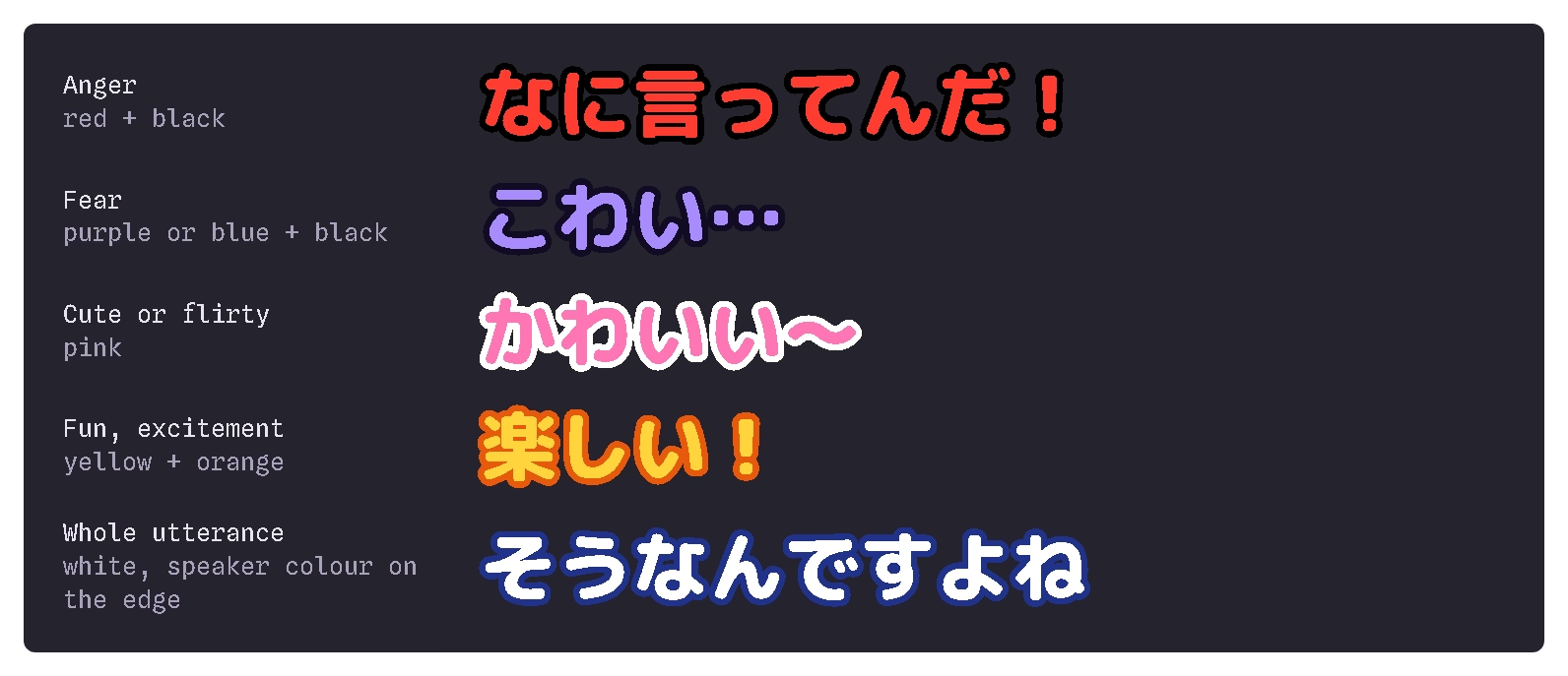
月曜から夜ふかし (Nippon TV) is the textbook case. Its street interviews are ◎: almost every word printed, in white with an edge colour per speaker. Its studio segments with Matsuko Deluxe are △: keywords only, in colours chosen by what is said. Across the survey, full-utterance telops stay in one colour family, mostly white, because long colourful telops are hard to read; cut-out keywords get bright stock colours by emotion (Figure 5). ORICON NEWS (2018) names the show among those whose telop acts as the comedy partner that delivers the tsukkomi, pointing out what interviewees themselves have not noticed is odd practice.
The show also supplies the cautionary tale. In March 2025, Nippon TV admitted that a 24 March broadcast had edited a street interview so that a Chinese woman appeared to say something she had not said; the network's president called it beyond the bounds of production, and street interviews were halted pending new rules (Daily Sports and Jprime, 29–31 March 2025). On-screen text must never put words in anyone's mouth.
4.2 Korea: Running Man
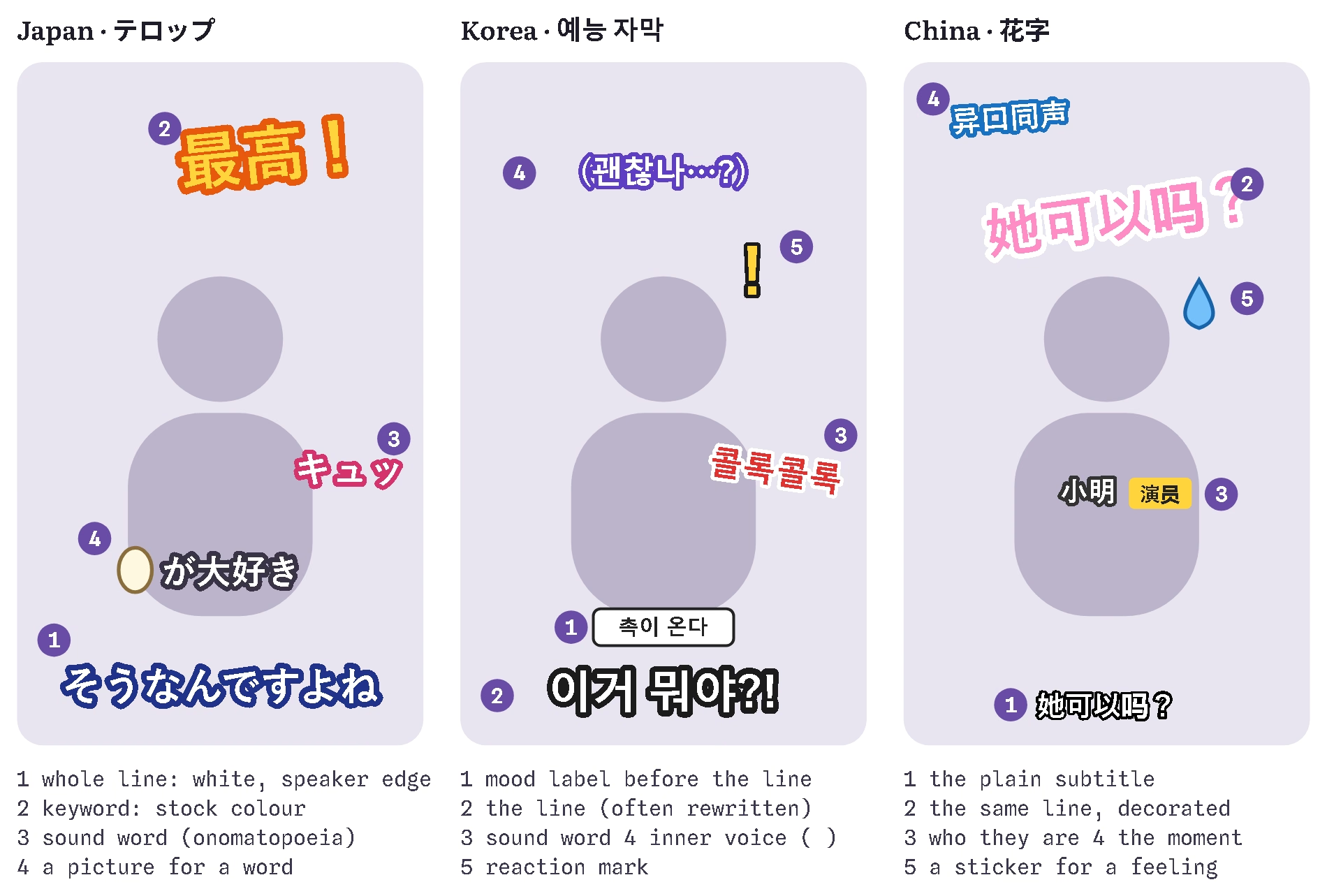
Comparing Japanese and Korean variety, Oh (2021) found Japanese telops mainly aid understanding, while Korean shows use far more captions for entertainment: lines rewritten for comedy, the speaker's feeling set before the line like a stage direction, word play, written onomatopoeia and expression marks, and inner monologue in parentheses study. Korean shows also give animals and objects speech and labels throughout, where Japanese shows do so only in comic set-ups (Oh 2022) study.
On SBS's 런닝맨, a frame from 2 June 2019 shows the devices together: a small mood label above a member's line, the line in large white type with a dark edge, a red onomatopoeia for coughing placed beside the cougher, and an exclamation mark for surprise (Twig24, 3 June 2019) practice. The captions are also the production team's voice: in December 2016 the team apologised to viewers on air in a caption (Tenasia), and Park (2015) shows how 무한도전, 1박 2일 and 런닝맨 use captions to state members' characters and to comment from an omniscient position study. That voice carries risk: viewers read the wording of a caption in the same 2019 episode as mocking a 1987 torture death, and SBS promised more care (Twig24).
4.3 China: 花字
The Chinese industry name 花字 covers decorated post-production text with images and sound effects (36Kr, 2017) practice; Zeng (2017) calls it a "third text" over the script and the picture, which activates background knowledge, marks the focus and guides interpretation study. Hunan TV's 爸爸去哪儿 (2013) made it famous: tags explained who people were for viewers who do not follow celebrities, and a Zhihu user counted explanatory 花字 at over 60% of one episode (second-hand, via 36Kr). 奔跑吧兄弟 repeated game rules on screen so viewers could follow, and recalled a running gag in new forms rather than labelling it the same way each time (Zeng 2017).
An editing tutorial analysing 奇葩说 describes three kinds of 花字, one per point of view: emphasis (the speaker's key phrase repeated), description (a bystander's reaction, exaggerated) and creative (the editor's commentary and imagined inner thoughts) (半撇私塾, 2017) practice. And rather than write "inwardly helpless" over a guest, editors use a sweat-drop sticker, an ellipsis and a sound effect (36Kr) practice: the picture adds a feeling nobody put into words.
4.4 VTuber clip channels
The evidence here is thin. I found no editor interview or analysis of hololive or Nijisanji clip-channel (切り抜き) telop conventions that could be opened; one Japanese article on the subject sits behind a members-only login and was left out. Clip channels work like variety shows (a recording of people talking, text added in post), so Sections 4.1–4.3 apply. The one VTuber-specific borrowing is a fixed colour per talent, which also matches BBC's speaker-colour rule opinion.
4.5 Five relations between text and speech
Table 3. What variety editors do with on-screen text, and where my proposal sits
| Relation | Examples | Proposal |
|---|---|---|
| Repeat all | white full-utterance telop on filmed segments; my captions today | the base layer |
| Repeat the key part, decorated | keyword telop; emphasis 花字; a host's catchphrase shown big | (d) style swap; keyword emphasis |
| Add what is not said | onomatopoeia, inner voice, mood labels, role tags, the tsukkomi | a separate lane (the strongest borrowing) |
| Replace a word with a picture | an egg picture inside a telop in place of 卵 (Higashino) | (b) emoji swap, (c) picture swap |
| Leave the words to something else | no telop on studio talk; hosts who refuse telop | (a) step aside |
Two things hold across all three traditions. First, the plain layer and the designed layer are kept apart: in another style, often in another place, and never pretending to be the subtitle. Second, the designed layer uses a small, consistent vocabulary (stock colours, fixed member colours, recurring tags) that regular viewers learn.
5. Two layers: the proposal
Layer 1, the record. The exported subtitle track (SRT and VTT) carries every word, in order, verbatim. It is what a deaf viewer switches on, what search and automatic translation read, and what my translations are built from. FCC, BBC and WCAG all require it standard, and any swap or step-aside that touched it would lose words in all three places.
Layer 2, the page. The burned-in page is a design layer over the record. It may make one of four moves, each with limits.
5.1 (a) Step aside
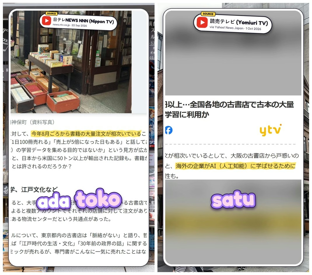
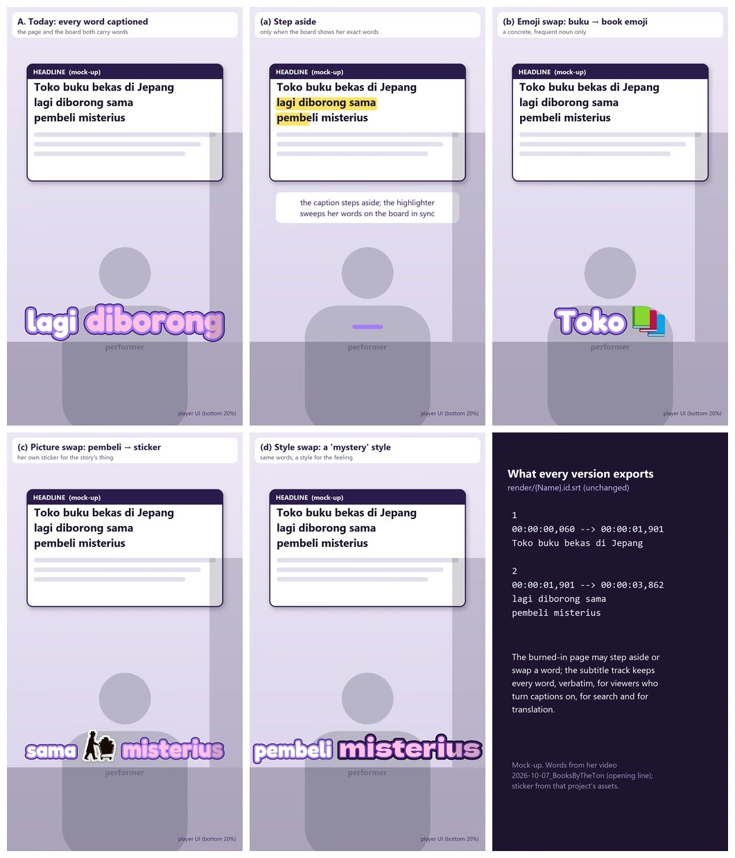
The caption hides while the same words are on screen. For: Netflix deletes forced narratives that duplicate on-screen text; every standard forbids covering featured text standard; identical on-screen text and narration impaired learning (Yue et al. 2013) study; Japanese studio talk often carries no telop at all practice. Against: on my channel the boards are mostly Japanese or English under Indonesian narration (Figure 2), so they rarely carry the spoken words; a phone-sized board may be less legible than the caption, which BBC 2.10 forbids standard; and a muted viewer must find the words elsewhere on screen. Limits: only when the board's highlighted span equals the spoken words (same language, same order), with the highlighter sweeping them in sync, at least as large as the caption, a small marker left in the caption band, and the caption back as soon as a word is spoken that is not on the board.
5.2 (b) Emoji
For: frequent emoji are read almost like words, and an emoji after its word is read faster than the word (Paggio & Tse 2022; Lu et al. 2025) study; 花字 use stickers to add feelings practice. Against: a replacing emoji costs about 300–350 ms, ambiguous ones more (Scheffler et al. 2021; Paggio & Tse 2022) study; deaf and hard-of-hearing users in two small studies found emoji captions ambiguous or unwanted (Oomori 2022; Zhang et al. 2025) study. Limits: prefer the emoji beside the word; replace only a concrete, common noun with one obvious emoji, never a verb, name, number or a word whose sound carries the joke; at most one per sentence, and never on a page that already has a keyword.
5.3 (c) Picture
For: Japanese telop does it (Higashino) practice; labels and pictures together help learning (Mayer & Johnson 2008, second-hand) study; a picture of the story's own object says what a word cannot. Against: everything that slows emoji applies more strongly to an unfamiliar picture, and a sticker the size of a word is small on a phone. Limits: only the story's main object or person, and only after its word has been heard and seen once, at least 1.3–1.5 times the caption's cap height, one per sentence, never stacked with an emoji.
5.4 (d) Style
The best supported of the four. BBC gives each speaker a colour for the whole programme standard; colour with weight or size helped deaf and hard-of-hearing viewers recognise emotion (de Lacerda Pataca et al. 2024) study; Japanese stock colours and Korean voice styles do it daily practice. Unexplained colour confuses (Zhang et al. 2025) study and stereotyped mappings draw criticism (Morikawa 2023), so the vocabulary stays small and fixed: my own voice, one colour per quoted person kept across videos, an aside or inner voice, two or three emotions, and a sound-word style, at most one change per sentence.
Table 4. Verdict on the four moves
| Move | Verdict | Use when |
|---|---|---|
| (a) Step aside | Yes, narrowly | the board shows the spoken words, in the spoken language, readable, highlighted in sync |
| (b) Emoji | Beside the word, yes; instead of it, rarely | a concrete common noun, one per sentence |
| (c) Picture | Rarely | the story's main object, after its first mention, one per sentence |
| (d) Style | Yes | a small fixed set of voice and emotion styles, used consistently |
| Verbatim export | Always | every version |
6. Guidelines and the strength of their evidence
Table 5. Guidelines for burned-in captions on 9:16 explainers (grades as in Section 2.4)
| # | Guideline | Grade | Main sources |
|---|---|---|---|
| 1 | The exported subtitle track stays verbatim, whatever the page does. | A | FCC; WCAG 1.2.2; BBC 2.1–2.2; Gernsbacher 2015 |
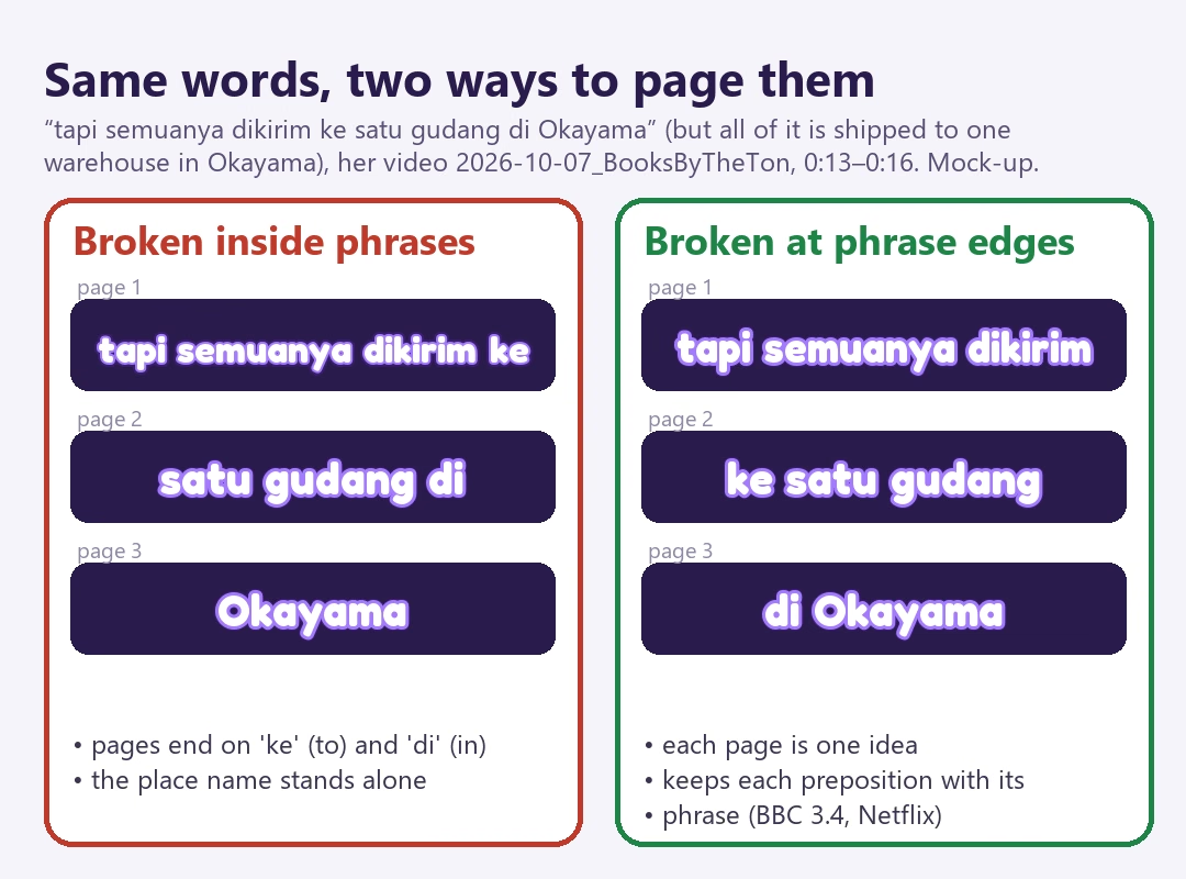
| 2 | Page by phrase: never end a page on a preposition, conjunction or yang; never split a name or a number from its noun. | A | BBC 3.4; Netflix; DCMP; Gerber-Morón et al. 2018 |
| 3 | Give each page time to be read: about 0.8 s at least, by merging neighbours, which needs room on the page (guideline 7). | A | Netflix; DCMP; BBC; Szarkowska et al. 2024; Section 7 |
| 4 | Keep captions off faces, mouths and on-screen text; on 9:16, lower third but above the player's controls. | A | FCC; BBC 10.1; Netflix; DCMP; Brown et al. 2015 |
| 5 | Outline or box all text: at least 3:1 contrast for large text, 4.5:1 for small. | A | WCAG 1.4.3 |
| 6 | Show the page whole and move the highlight, rather than building it word by word. | B | Rajendran et al. 2013 (live subtitles; test it) |
| 7 | Big type needs fewer words a line: pair large one-line looks with a second line or a leaner look for dense stretches. | B | BBC 9.2.1; Section 7 measurement |
| 8 | One keyword per sentence at most: the number, the name or the word the joke hangs on. | B | BBC 11.2; Finger Bou & Muñoz 2024; Morikawa 2023 |
| 9 | Colour means one thing, always: one colour per voice, two to four fixed emotion styles, encoded with colour plus weight or size. | B | BBC; de Lacerda Pataca et al. 2024; Morikawa 2023 |
| 10 | Sound words are a separate lane near their source, never in the caption band and never replacing speech. | B | WCAG 1.2.2; BBC 17; Sasamoto 2021 |
| 11 | Emoji beside the word, not instead of it; a replacing emoji only for a concrete common noun. | B | Scheffler et al. 2021; Paggio & Tse 2022; Lu et al. 2025 |
| 12 | One moving thing at a time; motion follows the voice; entrances of about 0.1–0.25 s. | C | Sasamoto & O'Hagan 2020 (preliminary); opinion |
| 13 | Step aside only for the exact spoken words, in sync. | C | Netflix redundancy rule; Mirzaei et al. 2014 (learners) |
| 14 | A picture stands in for a word only for the story's main object, after its first mention. | C | Higashino; Zeng 2017 |
| 15 | Test style claims on the channel itself; most "this caption style doubles retention" claims are vendor opinion. | C | opinion |
7. Implementation and a first result
My editor, Poiesis, burns captions into the video from the corrected word timings and writes the subtitle track separately, as two lines of up to 42 characters and 6 s, close to Netflix's numbers. As of 8 October 2026 it has:
- Phrase-aware breaks and a minimum page time, on by default. No page ends on a word that leads into the next (Indonesian function words plus
sama,buat,jadi), between a number and what it counts, or inside a name. A page shown for less than 0.8 s joins a neighbour when the two still fit the look's line, never across a sentence's end or a pause over 1 s. Only page boundaries move; the subtitle track never sees it. - A sound-word lane. A sound effect's cue may carry text, drawn telop-style beside its source and outside the caption band.
- An experimental display layer that can step a page aside or swap a word for an emoji, in the burned-in page only.
Planned next: voice and mood styles, emoji beside the word drawn with Google's Noto Color Emoji, an A/B test of whole pages against word-by-word building, and step-aside checked against the board's recognised words. Picture swap is deferred.
7.1 The minimum page time, measured
I ran the editor's caption code on all 12 projects with captions (Section 2.3). The result was not what the design intended.
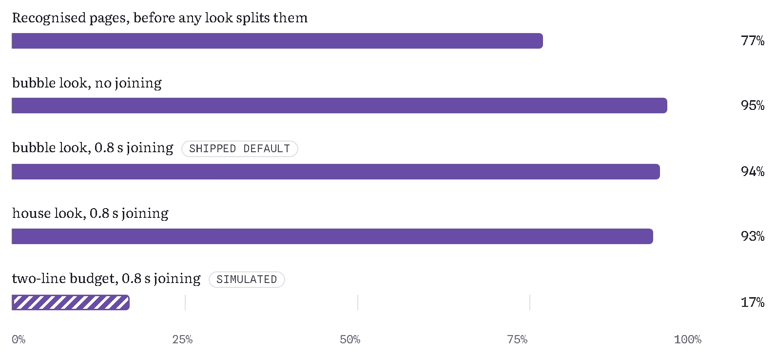
Table 6. Caption pages by condition (12 projects, 1080×1920)
| Condition | Pages | Median | < 5/6 s | < 0.5 s | Words a page |
|---|---|---|---|---|---|
| Recognised pages, before any look | 594 | 0.62 s | 77% | 24% | 1.94 |
bubble, no joining | 948 | 0.38 s | 95% | 69% | 1.22 |
bubble, 0.8 s joining (default) | 895 | 0.40 s | 94% | 65% | 1.29 |
| house look, no joining | 907 | 0.40 s | 94% | 65% | 1.27 |
| house look, 0.8 s joining | 849 | 0.43 s | 93% | 60% | 1.36 |
| two-line budget, 0.8 s joining (simulated) | 338 | 1.16 s | 17% | 1% | 3.41 |
The looks first split the recognised pages further: at 1080 pixels wide, with type about 6–8% of the frame's height and the spoken word drawn bigger still, a line holds little more than one word. That split shortens pages more than the joining rule can lengthen them, because a short page can only join a neighbour that still fits on the same line, and it rarely does. The rule joined about 5% of pages; the share under the minimum fell by one point.
The simulation shows where the room is. Giving a joined page a second line (BBC already allows three lines on 9:16) brings the median page to 1.16 s and the share under 5/6 s to 17%. Guideline 7 is therefore the precondition for guideline 3: a minimum page time only works where the layout leaves space to merge. The next change to test is a second line for joined pages, or a leaner look of about 5–6% of the frame height for dense stretches, keeping the big one-line type for the hook.
8. How to evaluate it
Most short-form caption claims are vendor opinion opinion, so the honest test is on my own channel, with YouTube Studio's per-video retention as a first read:
- Pagination: the same Short with today's pages against pages of at least 0.8 s on two lines. Measure average view duration, share viewed and rewatches.
- Build against page:
bubblebuilding word by word against whole pages with a moving highlight. - Designed exceptions: plain captions against captions plus a sound-word lane and one style change every ten seconds or so.
- A viewer check: a few deaf or hard-of-hearing Indonesian viewers, and someone watching muted, watch each version and say what they missed.
Variants go out a week apart on similar topics, or as a Shorts A/B test where the platform offers one.
9. Limitations
- One channel. The measurement covers 11–12 projects of one creator, one language and one format; the numbers describe this channel, not short-form video in general.
- Durations, not outcomes. I measured how long pages stay on screen, not what viewers understood or how long they watched. Section 8 is the plan for that.
- Small and indirect studies. Several studies are small (4, 11, 17 or 39 participants), the word-for-word finding comes from live subtitles, the emoji studies used running text in English and Chinese rather than captions, and none tested Indonesian.
- Second-hand and missing sources. Some claims are taken from the papers that cite them and are marked so; no credible source on VTuber clip-channel telop could be opened.
- The simulation counts characters and ignores the look's font, size and the grown spoken word, so it overstates what a real two-line layout would hold.
- I design the tool. I direct the editor whose defaults are evaluated here, and the research and measurement were carried out with an AI assistant (below). The data and code paths are my own and can be re-run.
10. Conclusion
Not every word needs to be drawn, but every word needs to be kept. The evidence supports a verbatim record that never changes and a designed page on top of it, which borrows from variety television its separation of layers and its small, consistent vocabulary: one colour per voice, a few emotion styles, a lane for sound words. Of the four moves, a style change is well supported, an emoji beside the word is safe, stepping aside fits only when the screen shows the very words spoken, and a picture in place of a word should be rare. The first measurement through the editor adds a practical lesson: the oldest rule in subtitling, give each page time to be read, cannot work in a layout that holds one word a line.
References
All accessed 7–8 October 2026. "Second-hand" marks works whose claims were taken from another source's summary.
Standards and platforms
- BBC (2026). Subtitle Guidelines, version 1.2.5. bbc.co.uk
- Described and Captioned Media Program. Captioning Key. dcmp.org
- Netflix (2022). Timed Text Style Guide: General Requirements. partnerhelp.netflixstudios.com
- Netflix (2025). Indonesian Timed Text Style Guide. partnerhelp.netflixstudios.com
- Netflix (2025). Japanese Timed Text Style Guide. partnerhelp.netflixstudios.com
- US Code of Federal Regulations, 47 CFR § 79.1(j)(2), caption quality standards. law.cornell.edu
- W3C. Understanding SC 1.2.2: Captions (Prerecorded) and SC 1.4.3: Contrast (Minimum), WCAG 2.2. w3.org
- Google Ads Help. Your guide to YouTube Shorts ads. support.google.com; TikTok Ads Help, TikTok Reservation TopView. ads.tiktok.com
Reading, captions and learning
- Brown, A., Jones, R., Crabb, M., Sandford, J., Brooks, M., Armstrong, M. & Jay, C. (2015). Dynamic subtitles: The user experience. ACM TVX 2015. research.manchester.ac.uk
- Finger Bou, R. & Muñoz Lahoz, C. (2024). The effects of textual enhancement on young learners' attention and vocabulary acquisition through captioned cartoons. diposit.ub.edu
- Gerber-Morón, O., Szarkowska, A. & Woll, B. (2018). The impact of text segmentation on subtitle reading. Journal of Eye Movement Research 11(4). bop.unibe.ch
- Gernsbacher, M. A. (2015). Video captions benefit everyone. Policy Insights from the Behavioral and Brain Sciences 2(1), 195–202. author copy
- Kruger, J.-L., Wisniewska, N. & Liao, S. (2022). Why subtitle speed matters: Evidence from word skipping and rereading. Applied Psycholinguistics 43(1), 211–236. abstract
- Li, J. (2024). Social media engagement: Can video captions increase user engagement? ICEDBC 2023, Springer. econpapers.repec.org
- Mirzaei, M. S., Akita, Y. & Kawahara, T. (2014). Partial and synchronized caption generation to develop second language listening skill. ICCE 2014. library.apsce.net (Montero Perez, Peters & Desmet 2014, second-hand)
- Rajendran, D. J., Duchowski, A. T., Orero, P., Martínez, J. & Romero-Fresco, P. (2013). Effects of text chunking on subtitling. Perspectives 21(1), 5–21. author copy
- StreamingMedia (20 May 2019). 80% of video caption users aren't hearing impaired, finds Verizon. streamingmedia.com
- Szarkowska, A. & Gerber-Morón, O. (2018). Viewers can keep up with fast subtitles: Evidence from eye movements. PLoS ONE 13(6): e0199331. journals.plos.org
- Szarkowska, A., Ragni, V., Szkriba, S., Black, S., Orrego-Carmona, D. & Kruger, J.-L. (2024). Watching subtitled videos with the sound off affects viewers' comprehension, cognitive load, immersion, enjoyment, and gaze patterns. PLoS ONE 19(10): e0306251. ueaeprints.uea.ac.uk
- Yue, C. L., Bjork, E. L. & Bjork, R. A. (2013). Reducing verbal redundancy in multimedia learning: An undesired desirable difficulty? Journal of Educational Psychology. author copy (Mayer & Johnson 2008, second-hand)
Emoji, pictures and expressive captions
- de Lacerda Pataca, C. & Costa, P. D. P. (2023). Hidden bawls, whispers, and yelps: Can text be made to sound more than just its words? IEEE Transactions on Affective Computing. arXiv:2202.10631
- de Lacerda Pataca, C., Hassan, S., Tinker, N., Peiris, R. L. & Huenerfauth, M. (2024). Caption Royale: Exploring the design space of affective captions from the perspective of deaf and hard-of-hearing individuals. CHI 2024. par.nsf.gov
- Lu, W., Du, H., Gu, F. & Han, J. (2025). The lexicalization of emojis. Frontiers in Psychology. frontiersin.org
- Oomori, K. (2022). A preliminary study on understanding online meetings using emoji-based captioning for deaf or hard of hearing users. University of Tsukuba. thesis abstract
- Paggio, P. & Tse, A. P. P. (2022). Are emoji processed like words? An eye-tracking study. Cognitive Science 46, e13099. um.edu.mt
- Ruhr-Universität Bochum (2021). Emojis can replace words in text (on Scheffler et al., Computers in Human Behavior 2021). news.rub.de
- Zdenek, S. (2018). Designing captions: Disruptive experiments with typography, color, icons, and effects. Kairos 23.1. kairos.technorhetoric.net
- Zhang, Y., Wen, Y., Hu, S. & Lu, Z. (2025). SpeechCap: Leveraging playful impact captions to facilitate interpersonal communication in social virtual reality. arXiv:2502.10736
Japanese telop
- Higashino, Y. Memes in Japanese language learning: Unintended consequences of the modern evolution of telop. CATJ Proceedings vol. 30. cla.purdue.edu
- 森川俊生 (Morikawa, T.) (2023). "文字だらけの画面"は何を映しているか: 地上波テレビ番組におけるコメントフォローテロップの現状分析. 『江戸川大学紀要』33, 267–280. edo.repo.nii.ac.jp
- 中野ナガ, ORICON NEWS (2018). バラエティ番組におけるテロップの役割に変化 「情報を補う」から「ツッコミ」に. oricon.co.jp
- Sasamoto, R. & O'Hagan, M. (2020, preprint). Relevance, style and multimodality: Typographical features as stylistic devices. Dublin City University. doras.dcu.ie; DCU news release (2016) on impact captions. dcu.ie
- Sasamoto, R. (2021, preprint). Onomatopoeia, impressions and text on screen. doras.dcu.ie
- デイリースポーツ (31 Mar 2025) and 週刊女性PRIME (29 Mar 2025), on the fabricated interview in 『月曜から夜ふかし』. daily.co.jp; jprime.jp
Korean 예능 자막
- 呉恵卿 (Oh, H.-G.) (2021). 芸能バラエティ番組における文字テロップの日韓比較. 『大阪大学言語文化学』30, 37–53. ir.library.osaka-u.ac.jp
- 呉恵卿 (2022). 日韓の芸能番組における動物の擬人化. 『語学研究』37, 107–119, ICU. icu.repo.nii.ac.jp
- 박상완 (Park, S.-W.) (2015). TV 예능 프로그램의 연극적 기획 전략에 관한 연구. 『대중서사연구』21(3). accesson.kr
- Park, J. S.-Y. (2009). Regimenting languages on Korean television: Subtitles and institutional authority. Text & Talk 29(5), 547–570. (second-hand)
- 트윅 (Twig24, Seoul Shinmun) (3 Jun 2019). 런닝맨 자막 논란. twig24.com; 텐아시아 (25 Dec 2016). tenasia.co.kr
Chinese 花字
- 南七道 & 陈旖 (2017). 为什么视频花字如此流行? 36Kr. 36kr.com
- 半撇私塾 (2017). 《奇葩说》综艺剪辑的3种花字套路. Toutiao. toutiao.com
- Zeng, G. (2017). The communication value of multi-style subtitles. ICESAME 2017, Atlantis Press. atlantis-press.com
Figure credits
- Figures 1 and 8 and Tables 1 and 6: my own caption data, measured for this post.
- Figure 2: frames from my video of 7 October 2026; the article screenshots in them are shown with the video's own source credits (日テレNEWS NNN; 読売テレビ via Yahoo! News Japan).
- Figures 3, 4 and 7: mock-ups made with my own words; Figure 7's sticker is the project's own and the headline card is invented.
- Figures 5 and 6: drawn from the documented rules and devices; no broadcast frame is reproduced. The underlying research report quoted frames from papers and articles; they are left out here.
Acknowledgements. The literature review, the measurements and the draft were prepared with Claude (Anthropic) under my direction, using my editor, Poiesis. I am responsible for the content.